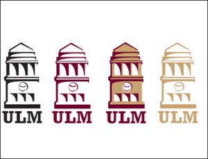
 With the new school year came quite a few changes, one in particular—a revamped logo.
ULM President Nick Bruno revealed the new institutional logo on Aug. 12 to a jam-packed room.
The Office of Public Information worked to create the new logo with ULM’s own Director of Graphic Design, Christi Bailey, designing it.
“I like how they have more than one design; it’s more versatile now,” said senior management major Jaquita Smith.
Our previous logo placed emphasis on the Kitty Degree Bell Tower, as its symbol was centered, with the university’s name circled around it.
The previous logo was “restrictive in its usage,” said Bruno. And several variations of the new logo were produced “in order to meet the needs of anyone who uses it.”
According to Bruno, the new logo is a better representation of the university brand.
The new designs are considered modern versions of its predecessor and continue to place emphasis on the Kitty Degree Bell Tower.
“It caught me off guard, because I’m so used to looking at the old one,” said sophomore Toxicology major Myeshia Hamilton-Moore. “I’m not sure why we needed a new logo, but it’s cool. It goes along with all the other changes around campus.”
The new logo will be used on envelopes and other stationery item connected to campus.
Categories:
New logos kick off of change
August 19, 2013

0
More to Discover


