Over the past few years, ULM athletics has been using the P-40’s likeness in uniforms and apparel. As someone who loves the design and the heritage of the P-40, I’m excited for the design to get more attention in the future.
For context, whenever you see an angry plane with shark teeth, you’re looking at the decal of the Curtiss P-40 Warhawk.
Lt. Gen. Claire Lee Chennault flew the Warhawk along with his “Flying Tigers” airmen in World War II.
They have their roots in the region, so laying claim to the design isn’t an of-the-wall choice.
The group became iconic, and Chennault’s name spread throughout Northeast Louisiana.
Many years later, when trying to decide what the then ULM Indians should be called, a poll chose the name for the mascot, the Warhawks.
The suggested name was endorsed in 2006 by the ULM Mascot Committee, but the true meaning of the Warhawk has still not been 100% incorporated in the marketing of our university, and I wish it would.
Despite the Warhawk not being an actual bird, a lot of logos between the beginning of the Warhawk era and the modern day depicted a bird rather than the fighter plane.
No logo went farther above and beyond to depict a bird than the 2006-10 logo. Included were a maroon bird with talons out, wings spread and a lightning bolt in its grasp.
While the previous logos are not bad, they don’t capture the meaning of a Warhawk.
To pay homage to the real deal, the athletics department has been using the P-40 design both for clothing for and athletic uniforms.
One of the most iconic uses of the P-40 iconography is the shark face decal.
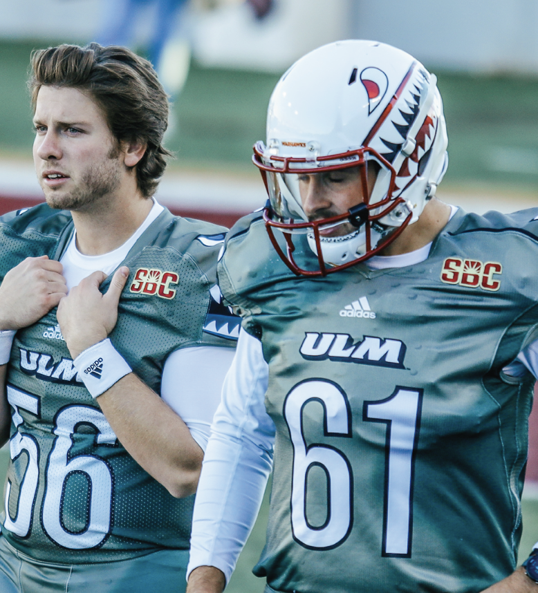
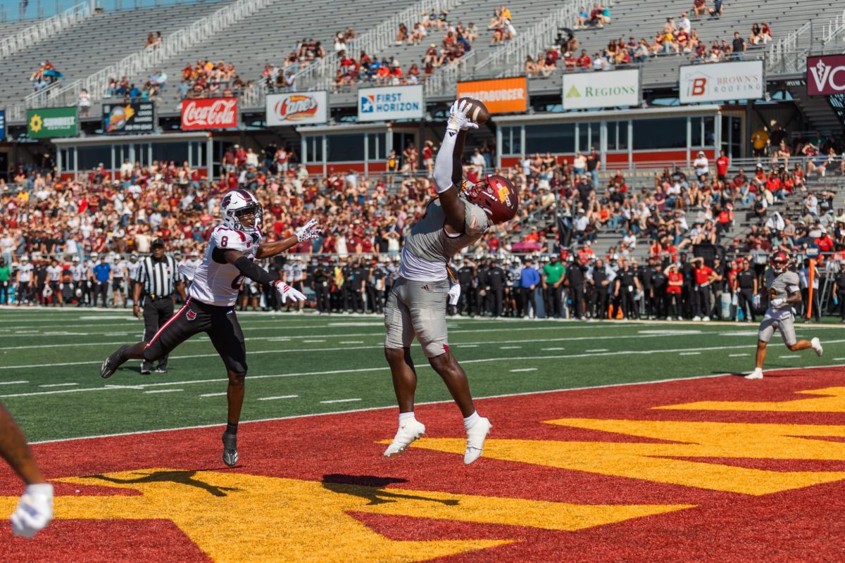
This design fits much better than the previous NLU throwback logos that appear on everything. The football team sometimes uses the shark face on its helmets, which looks intimidating, just as a football team should be. They wore it for the first three games of the year, with one being on national TV.
On top of the decal, another aspect of the P-40 that I love is the shades of dark green or camouflage on jerseys.
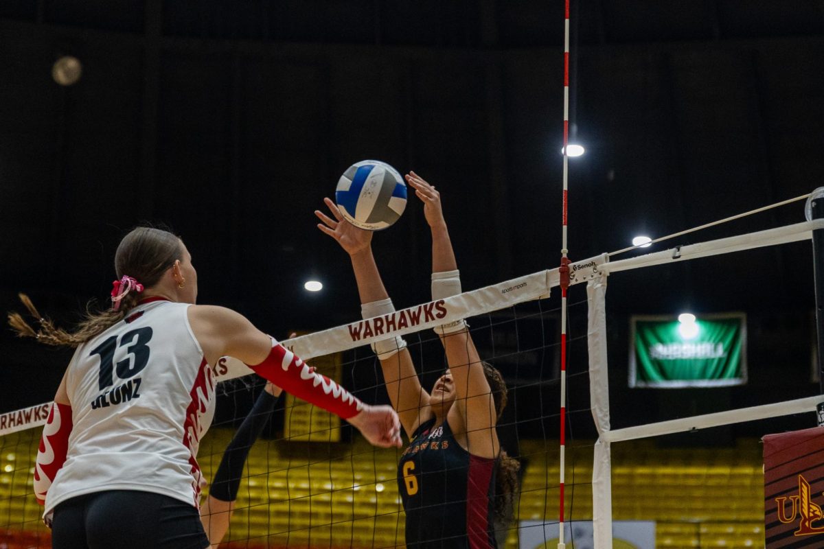
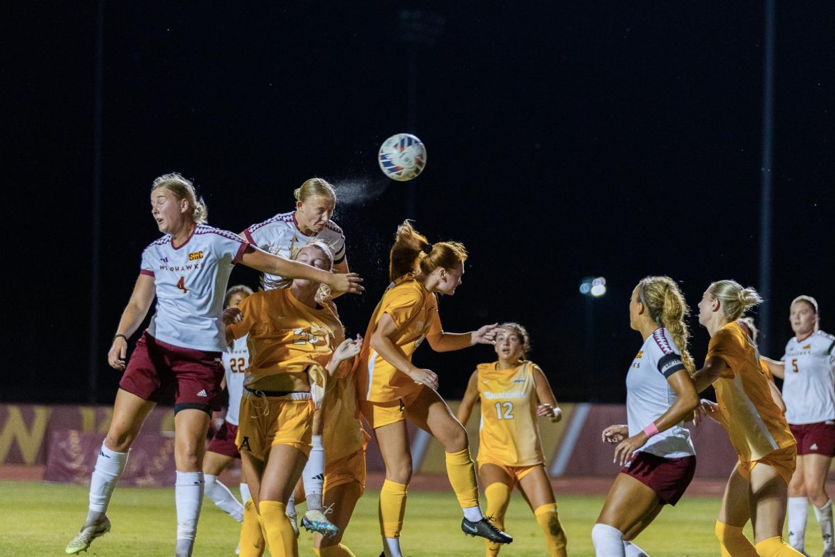
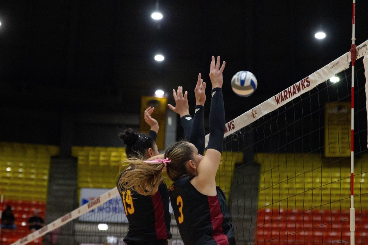
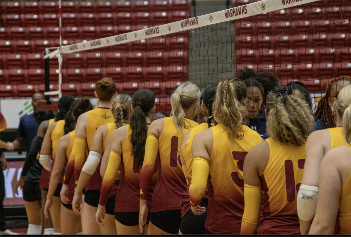
So far, softball, baseball and basketball already have camo jerseys, but I want to see more sports incorporating either a camo color palette or design on their athletic uniforms, such as the volleyball team or soccer teams.
With the P-40 designs, ULM has a chance to set itself apart from other institutions by not simply slapping an academic logo on a uniform or equipment and calling it a day.
ULM can stand out from most schools and have an image that goes beyond the three-letter acronym logo for everyday purposes. Breaking away from the norm gets other schools and those watching the game to pay attention more.
Riding the hype of the plane, it’s possible for ULM to make a name for itself for wearing camo jerseys. Big schools, namely Oregon, get a lot of attention for unorthodox uniforms, so I say, why not commit to the Warhawk design and wear the camo jerseys more often?
ULM having a military background gives a clear and understood reason for military-themed athletic apparel, so go for it.
In the realm of student clothing, the olive-green P-40 decal shirt for the 2022 military game is a great way to push ULM’s military background and reference the Warhawk.
Using the white-out shirts from this year’s Army West Point football game as an example, it’s easy to see that the athletics program wants to do more with the P-40, and I’m all for it. I want to see more usage of the shark mouth decal, and I want to see more references to Lt. Gen. Chennault.
While I don’t dislike the current usage of logos and designs for athletics, I do feel the P-40 is the way to go because of the heritage. The P-40 is a story that can be told every time someone wears a shirt with the plane’s design on it.


D. Thomas • Feb 5, 2025 at 9:36 pm
Outstanding!…I’m a little late to the party but came across this recently and thought “what a great way to pay homage to the men who fought for our country”. Well done ULM!